Graphics:GUI
The Adonthell engine provides its own custom user interface that relies on specific sets of images to render individual widgets. The graphics used by a widget are defined in widget decoration files. Below we learn how the individual images are composed to form the different widgets.
Standard Widgets
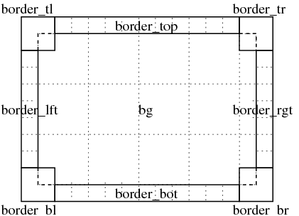
The basic elements of standard widgets are a background and a border, either of which is optional. However, widgets without background and border are basically invisible, unless they contain additional elements, like the text of a label widget or the image of a canvas widget. So the standard case is a widget with a background and a border.

Dynamic Sized Widgets
If a size is specified for the widget, background and border elements are used repeatedly to fill the whole area covered by the widget. We call that "tiling" and it's indicated by the dotted lines.
The background will be rendered first, tiled to the area inside the widgets border. Then any remaining content of the widget is rendered, like child widgets or a scroll bar. Next, the edges of the border are rendered, tiling the area between the corners. Those are rendered last. If larger than the border edge, the corner pieces will overlap background and content of a widget.
Fixed Size Widgets
In case no size is specified, the background image determines the widgets size and no tiling will occur. In that case, it is best to omit the border elements and give the background image the look of the desired widget. Any text or other content will then be rendered on top of that background.
Indicator Widget
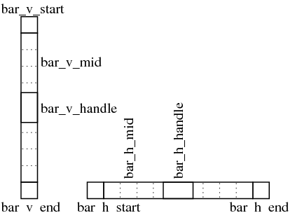
The indicator widget consists of two parts. A bottom layer that is built from standard widget elements and a top layer (the indicator) that is composed from additional elements. Even though a specific indicator might only be used in one orientation, graphics for both orientations have to be provided.
